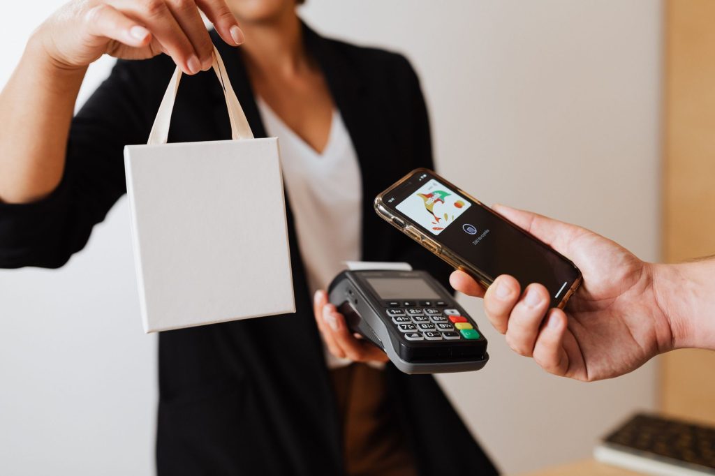
A mobile checkout has little space to explain a consequential action. The screen may show a product, payment option and button, with details elsewhere. Good design keeps the essential information close to the decision. Customers should understand the amount, the recipient and what will happen after confirmation. For businesses, that means treating checkout as a sequence of connected steps rather than a final screen added after the shopping experience is finished.
Keep the order visible
Before choosing a payment method, customers need a recognisable summary of their purchase. Show the item or service, quantity, applicable delivery charges and final currency. If an option changes the total, update the summary where people can see it. A customer should not have to remember a figure from an earlier screen while deciding whether a new amount is correct.
Retail apps need similar clarity. The site's technology coverage provides context for digital products and their design. A useful payment experience begins with the shopping task itself: selecting the right item, checking its availability and understanding fulfilment. An elegant payment button cannot repair uncertainty about what is actually being bought.
Explain the next screen
Some payment methods move a customer from the merchant's page to a bank or payment service. That change should feel expected. A short instruction can explain where the customer is going and that they will return afterwards. Preserve the order summary so the amount remains easy to recognise. Avoid vague wording that leaves people wondering whether they have opened an advertisement or an unrelated login page.
Stripe's iDEAL documentation describes a bank-redirect payment flow and currently uses the iDEAL | Wero name. Its documentation addresses the branding transition. This is a useful reminder for product teams: payment terminology needs maintenance, just like prices and delivery information. Explain the flow supported by your own integration rather than copying a description that may refer to a different implementation.
Describe what the payment method actually does
A familiar logo does not explain every action a service supports. A merchant may accept a particular method for purchases while handling refunds through a defined process. One comparison illustrates why functions need separate labels: iDEAL casinos compared on CasinoVergelijker covers casino deposits and related payment conditions. For an ordinary retail checkout, the same clarity means explaining how payment, confirmation and any later refund connect. The logo cannot explain those processes.
Keep the language specific. ‘Confirm your payment in your banking app’ describes an action. ‘Enjoy seamless convenience’ does not tell anyone what to do. If an account or additional step is required, introduce that information before the customer reaches it. Short instructions can remain friendly without hiding the practical details behind promotional language.
Give every outcome a clear message
A successful payment, a pending payment and a failed attempt are different states. Each needs an appropriate message and next step. A receipt should identify the order and amount. A pending message should explain where the status can be checked. A failed attempt should distinguish between an incomplete order and an order that still exists but has not been paid.
This matters when a connection drops or a customer closes a window. Design the support route around the information people actually have: an order reference, a timestamp and an amount. Do not ask them to understand the technical cause of a problem before requesting help. Likewise, avoid encouraging repeated payment attempts when the status of the first one is still unclear.
Test the uncomfortable moments
Teams often demonstrate the ideal path on a fast connection with a familiar device. Add less convenient scenarios to the review. Increase the text size. Switch between apps. Return after a delay. Ask someone unfamiliar with the checkout to explain what they believe has happened at each stage. Their interpretation is more informative than whether they can eventually find the correct button.
Finally, assign ownership to the messages after payment as well as those before it. Checkout does not end when money moves. The customer still needs confirmation, access to the purchase and a way to resolve questions. When these pieces agree with one another, a small screen can carry a clear, complete transaction instead of leaving the customer to assemble the story.