From Minimalism To Luxury: Creative Cosmetic Labels

Your product’s label is often the first interaction a customer has with your brand. In the saturated beauty market, standing out is not just an advantage; it’s a necessity. Effective cosmetic labels do more than list ingredients: they tell a story, evoke a feeling, and build a connection.
This post explores the latest creative directions for modern cosmetic and skincare labels. We will cover everything from minimalist designs to luxurious aesthetics, providing inspiration to help your beauty product labels capture attention and drive sales.
The Power of Minimalism
Minimalism in beauty product labels continues to be a dominant trend, and for good reason. A clean, simple design conveys sophistication, honesty, and a focus on the product itself. This approach is particularly effective for brands that champion natural ingredients and transparent formulations.
Key Elements of Minimalist Labels:
- Clean Typography: Utilise sans-serif fonts like Helvetica, Futura, or Arial. The text should be crisp, legible, and strategically placed. A well-chosen font can be the main design element.
- White Space: Don’t be afraid of empty space. Generous use of white space draws the eye to key information and creates a sense of calm and clarity. It makes the label feel uncluttered and premium.
- Simple Colour Palettes: Stick to a monochrome scheme or a limited palette of two to three complementary colours. Neutral tones like black, white, grey, and beige are staples of minimalist design.
Minimalist skincare labels work well for private label cosmetics aiming for a modern, chic, and trustworthy image. The focus is on what’s inside the bottle, and the label design reflects that purity.
Embracing Bold and Vibrant Colours
While minimalism has its place, some brands are making a splash with bold, eye-catching colours. Vibrant cosmetic labels can inject energy and personality into your product line, making it pop on both physical shelves and digital screens. This direction is perfect for brands targeting a younger, more expressive audience.
How to Use Colour Effectively:
- Colour Blocking: Pair contrasting, solid colours to create a dynamic and modern look. Think bright pinks with oranges or electric blues with greens.
- Gradient Effects: Soft, blended gradients can add depth and a touch of dreaminess to your labels. This works beautifully for products that promise a transformative experience.
- Monochromatic Vibrancy: Using different shades of a single bold colour can create a powerful and cohesive brand identity. For instance, a range of products all featuring different tones of purple.
When using bright colours, ensure your text remains readable. A bold design should still be functional and communicate essential information clearly.
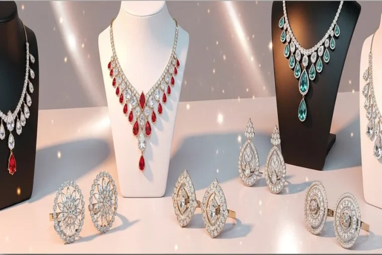
The Allure of Luxury and Elegance
For high-end beauty products, a luxurious label is non-negotiable. This design style communicates premium quality, exclusivity, and a superior user experience. It appeals to consumers who are willing to invest in top-tier products.
Creating a Luxurious Look:
- Metallic Foils: Gold, silver, rose gold, and copper foils add an immediate touch of opulence. Use them for your brand name, logo, or as decorative accents on your cosmetic labels.
- Textured Finishes: Incorporate tactile elements like embossing (raised design) or debossing (indented design). A textured paper stock can also make the product feel more substantial and high-end.
- Elegant Script Fonts: Ornate, calligraphic fonts can add a classic and sophisticated touch. Pair them with a clean sans-serif font for balance and readability of the ingredient list.
Luxury skincare labels often feature intricate patterns, dark colour palettes, and a focus on craftsmanship. These details signal to the customer that they are purchasing something special.
Illustrated and Artistic Designs
Another growing trend is the use of custom illustrations and artistic elements on beauty product labels. This approach allows brands to showcase their unique personality and creativity, transforming each product into a small piece of art.
Incorporating Artistic Elements:
- Botanical Illustrations: Detailed drawings of flowers, leaves, and other natural ingredients can highlight the product’s organic origins. This is a popular choice for natural and vegan brands.
- Abstract Art: Abstract shapes and patterns can create a modern, avant-garde feel. This direction is great for innovative brands pushing the boundaries of the beauty industry.
- Hand-Drawn Touches: A whimsical, hand-drawn logo or illustration can make the brand feel more personal and approachable.
Illustrated labels help tell a brand’s story visually, creating a memorable identity that resonates with customers on an emotional level.
Your Label, Your Brand
The design of your cosmetic labels is a critical part of your brand strategy. Whether you opt for clean minimalism, vibrant colours, luxurious finishes, or artistic illustrations, the key is to create a design that is authentic to your brand’s values and speaks directly to your target audience.
By carefully considering these creative directions, you can develop beauty product labels that not only look beautiful but also work hard to build your brand and drive your business forward, with expert guidance from nebulic.